Marketing Websites and Stripe's Redesign
Alfred Lua / Written on 17 July 2020
Hello there,
This week's note was on the career growth lessons from my five years at Buffer, mostly related to my recent promotion. Sorry if it feels like a brag. Most people care about getting promoted, for various reasons, but few talk about it. I hope sharing my experiences can help you progress in your career, regardless of your goals.
Onto this week's analysis:
An often-neglected opportunity
The marketing website of tech startups is usually the most visited, often more than their blogs and other resources. The homepage, especially, gets the largest percentage of traffic.
But it is often neglected because it doesn't fit squarely into any teams.
During a website update last year, we removed a button on the homepage that links to a product page where people can start a Buffer trial. The total number of trials started fell by almost half. Visitors could still start a trial at various places on the website and that particular product page. It was "just" that visitors couldn't access the product page from the homepage. The trial conversion rate was unlikely going to double, so our MRR growth would have fallen. We brought back that button immediately, and the trials number bounced back. This incident taught me how much the marketing website could impact the business. If you think about it, this makes sense. The marketing website, especially the homepage, is the first touchpoint that a potential customer has once she is interested in your product. It is also where they would start a trial, signup for a free plan, or start a subscription.
If it's the marketing website, then maybe the marketing team should be in charge of it. But many marketing teams only have marketers, who are non-technical, and no engineers. And many marketers focus on only brand awareness and traffic generation. Once the traffic arrives at the website, there's nothing much they can do if they can't change anything to the website. On the other hand, for engineers, working on the product is more than often being prioritized over working on the marketing website. Or the marketing website and any changes would be kept simple so as to not take up too much of the engineers' time. I had experienced all these at Buffer.
This situation has gotten a bit better with tools like Webflow, which gives non-technical marketers the ability to create and update webpages. Marketing engineer, an engineer who works on marketing projects, is also becoming a more common role in startups. Some companies, like Square, even have a Marketing Web team. But startups would still first hire engineers to build the product and marketers to do marketing first. The marketing website is rarely any team's first concern.
So I was glad to see Stripe redesign its website because it would, and it did, generate a ton of conversations in the tech space and shine the spotlight on this often-neglected opportunity.
The website hierarchy
Instead of analyzing specific designs of the new stripe.com, I think it's more important to look at the big picture. What Stripe has done well is to create a simple organization of its webpages.
At this point, it's important to know that Stripe has 11 products, unlike most tech startups, which only have one. So the function of Stripe's homepage is different from most tech startups'. The purpose of its homepage is not to sell its products or describe its features but to sell what the company provides. So in terms of the website hierarchy, the homepage is one level more abstract than most tech startups' homepage, which essentially is a product page.
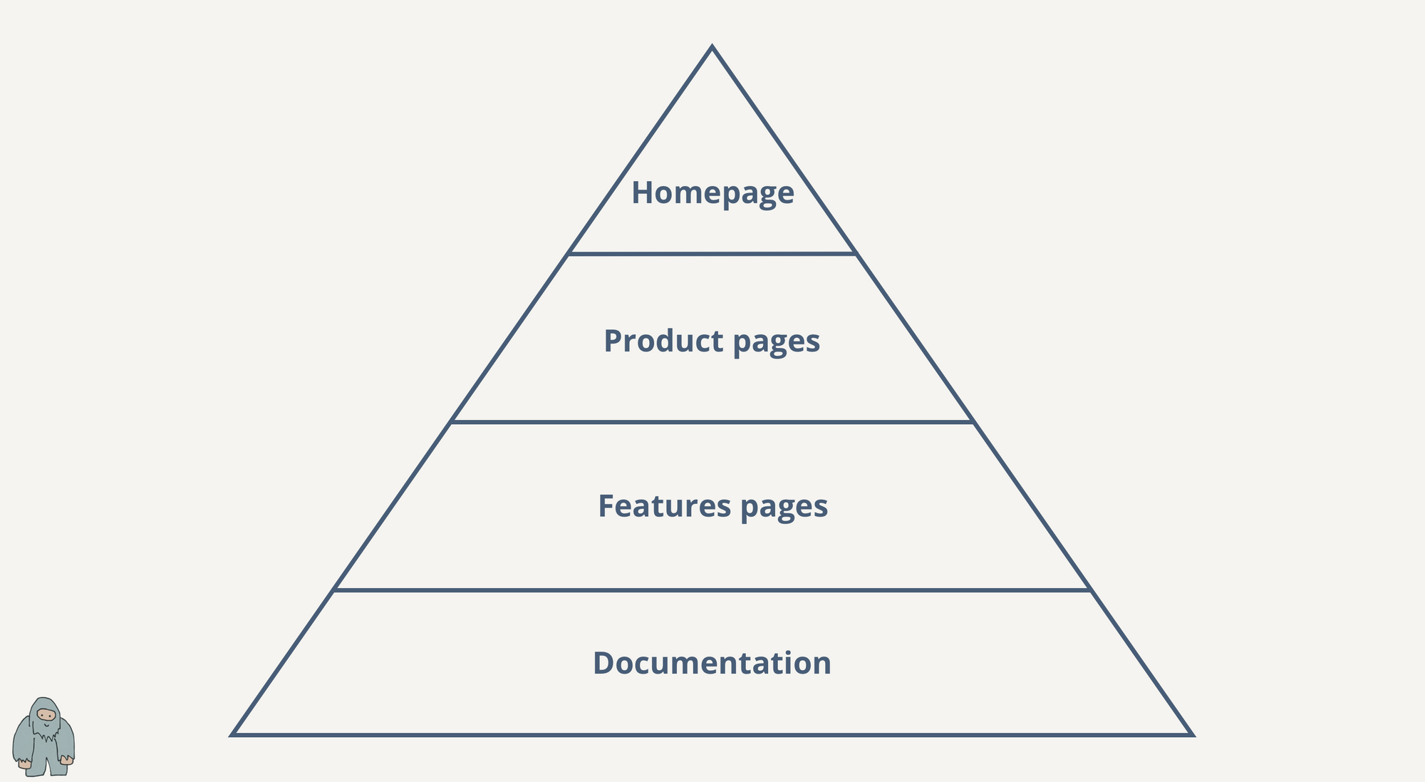 Besides the two main call-to-actions, Start now and Contact sales, the next call-to-action on the homepage is to "Start with payments". In other words, explore Stripe Payments, its main product. The Payments product page provides an overview of the product. People who are interested can dig deeper to see the full list of Payments features. If they want to go even deeper, they can check out the Payments docs. This pyramid structure allows Stripe to surface the most essential information first and to let people with a higher intention to sign up explore the website further themselves.
 Overview, Features, and Docs on the Payments product page
This is both a good UX and good SEO practice. Visitors can navigate the website in a systematic way to find more and more detailed information. Website crawlers also get to crawl the webpages in the order of their importance (homepage > product pages > feature pages > documentation).
Overview, Features, and Docs on the Payments product page
This is both a good UX and good SEO practice. Visitors can navigate the website in a systematic way to find more and more detailed information. Website crawlers also get to crawl the webpages in the order of their importance (homepage > product pages > feature pages > documentation).
You can see a similar website hierarchy used by multi-product companies such as Atlassian, HubSpot, and Shopify.
A consistent story
Unlike other payments platforms like FastSpring and Adyen, Stripe sells mainly to developers. They betted on the fact that payments infrastructure decisions will eventually be technical decisions and not business decisions. Developers and not business people would decide what payments platform to use. In hindsight, that bet went well for them.
You can see their developer focus all over their marketing website. Quite directly, you see the word, "developers", on most pages. Even better, code is embedded throughout the website, too. The original idea of Stripe is that developers can receive payments online by adding just seven lines of code. The concept of being able to receive payments with just a few lines of code still exists, so it makes sense to show the code on its website.
Show, don't tell.
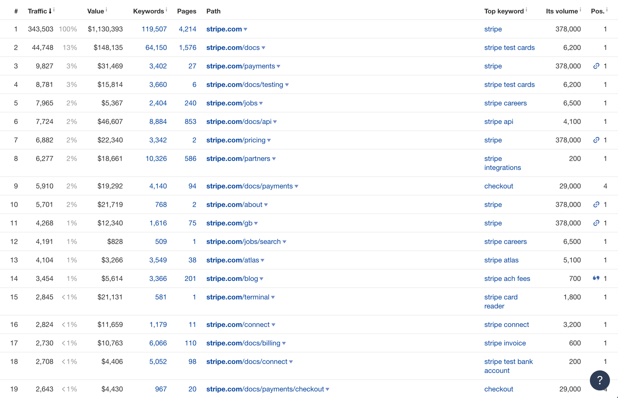
After its homepage, Stripe's documentation is the next most visited place on stripe.com. The company probably puts in more than twice the amount of effort into their documentation than other payments companies. Because it is selling to developers, having great documentation is a must-have.
Features or benefits? Neither
There was an interesting conversation on Twitter that website copy should focus on features, not benefits. "Accounting software", not "Easily manage your company's financial future on all your devices".
I think debating on whether websites should focus on features or benefits misses the bigger picture. The things to consider should be the maturity of the brand and the complexity of the product. The more mature your brand is, the less specific you need to be. But the more complex your product is, the more specific you need to be. The balance is more of an art than science.
Let’s consider Buffer as an example first.
Buffer has an established brand in the social media management space. It's hard to argue someone would visit buffer.com without knowing Buffer is a social media management tool. (If that's the case, the issue is our marketing, not the website.) Also, social media management tools are fairly commoditized. If you look at the top companies in the space, such as Buffer, Sprout Social, Hootsuite, and Later, the products all do roughly the same things: scheduling, analytics, and engagement. Because Buffer has a mature brand and a simple product, we can afford to be less direct about our product on our homepage and use more creative copy that would differentiate us from our competitors. When people visit buffer.com, they already know Buffer is a social media management tool. We don't have to say that explicitly. What they want to know is how is Buffer better than other social media management tools. For example, we have been trying to tell the story that Buffer helps you with building your brand, not just managing your social media.
How about Stripe?
It also has an established brand. Most who visit stripe.com would know Stripe is related to payments online. But it doesn't sell a single product. It has 11 different products. It can't possibly explain all 11 products and features on its homepage. That’s why I like its website hierarchy, as mentioned above. At the very top is its homepage, which provides enough and clear information to hook the visitor and make her dig deeper for more information. On its homepage, it says it is "a fully integrated suite of payments products", it provides "the world’s most powerful and easy-to-use APIs", it takes "a technology-first approach to payments and finance", and it is "the backbone for internet business". It's neither features nor benefits. Then people who are more interested can navigate to see the products, features, and documentation. Even though Stripe has a mature brand, with such product complexity, it has to be much more specific on its homepage than Buffer. Otherwise, visitors will bounce before exploring further.
For a company with a young brand, even if it has a simple product, it needs to be more specific about what it does than one with a mature brand because people don't already know what they sell. For example, Later came into the social media management space several years later than Hootsuite and Buffer and positioned itself, successfully, as an Instagram scheduler.
Incomplete update
Finally, something that most people probably didn't notice is that Stripe didn't redesign all the pages of its marketing website. It updated only the homepage and a few top product and feature pages. Several product pages and the pricing page still have the old design.
We also did a website redesign at Buffer last year. Similarly, we only updated a few key pages, especially those with crucial in the user journey (i.e. homepage, product pages, and pricing page). But we only had a team of three working on it. A copywriter, a designer, and an engineer. So I'm surprised Stripe, likely with a much bigger website team, didn't update all its webpages.
I can think of a few possible explanations. The first is it'd take far too long to redesign and ship all the webpages at a go. So they planned to update the webpages in phases and picked few most visited webpages first. But that doesn't explain why the pricing page, likely the most visited page after the homepage, wasn't updated. The second possible explanation is the pricing page, which lists the pricing for all their products, is a key step in Stripe's acquisition funnel. Updating it could drastically impact their customer acquisition—positively or negatively. So the team separated it out from this redesign and would A/B test it in the future before making big changes to it. My guess is it's a mix of these two reasons. (If you are from Stripe and know the reason, please let me know!)
Stripe has more than 2,500 employees. For those of us who work at smaller companies, it should be heartening to know that even Stripe doesn't update all the pages of its marketing website at a go. Granted they have more webpages than most because they sell many products, they also have a much bigger team than most and are known for their high-quality webpages. Like how most people only focused their attention on Stripe's new homepage, it's likely most people don't care about an old page on our websites. (In fact, there are many old pages on buffer.com, like the one I built in 2018.)
Overall, I'm glad Stripe's website redesign has attracted much attention in the tech space on the often-neglected marketing website. While most marketers tend to focus on top-of-the-funnel work, the website, especially the homepage, should not be neglected.
When was the last time you updated your homepage? ;)
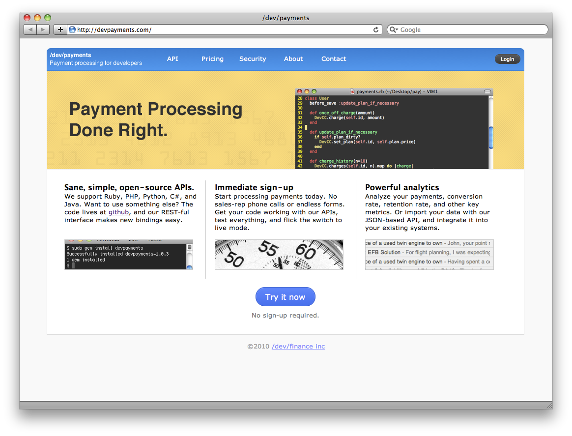
And just for fun, here's the first version of Stripe's homepage: