Doubling Trial Starts: A Packaging Lesson
Alfred Lua / Written on 27 May 2020
Hello there,
Two quick things on my mind:
- I spent the public holiday on Monday building Behind the Brand. I want it to be a place where e-commerce social media marketers can learn from other brands but I'm a bit stuck on what to do next. What do you think I should do?
- We are trying OKRs again at Buffer, and I'm trying to learn more about it from John Doerr's book, Measure What Matters. If you have successfully implemented or used OKRs at your company, can I hear how you are using OKRs?
Thank you!
Onto this week's note:
The experiment that doubled trial starts
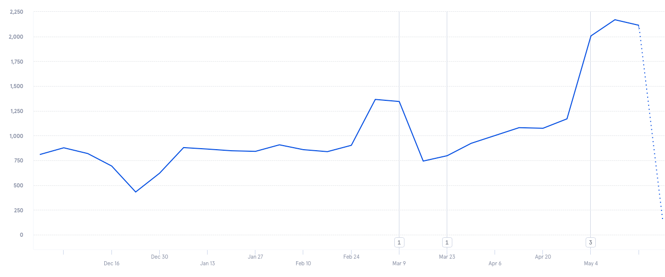 We rolled out the new page on May 4.
Last week, I shared my failed bundle experiment with you [1]. Today, I'm excited to tell you about the follow-up experiment, which was a success. We then rolled it out as soon as possible. You can see it here.
A quick recap: Buffer now has two products (Publish and Analyze) but visitors could only start a trial for one of them at a time. Most of them were trying only our flagship product Publish because it's more prominent on our marketing site. This became a problem because many churned when they thought Buffer doesn't have analytics.
We do.
We had a packaging issue.
There's marketing, and there's packaging
Marketers often think about different marketing channels, new acquisition strategies, and wild growth ideas. Few think about packaging. Sometimes, a different packaging is what a company needs to grow. And that was the case for us at Buffer.
We get thousands of signups every day. But most people were signing up for Publish and not Analyze. So the challenge wasn't to get more signups but to help visitors know about Analyze.
If people are signing up for Publish, why not package Publish and Analyze together?
That's when I started to experiment with packages. With just a click, visitors should be able to start a trial for Publish and Analyze together.
The first experiment showed some positive signs but nothing conclusive.
Conventional wisdom says tweak only one part of the experiment so that when the results change, you know what exactly caused the change. But we were still exploring and not optimizing. If we start optimizing now, we might get to a local maximum and never find the global maximum.
Even if we were to double or triple the results of the previous experiment, it would still be a failure. We had to rethink as many things as possible.
How should we offer our products on our website so that visitors would know Buffer has publishing and analytics products?
Out of sight, out of mind
The first challenge was letting visitors know we do have more than one product and they can get them together.
I was not confident enough to test the packages on our homepage yet because I wasn't sure how it'd affect our biggest signup flow. I wanted somewhere on our marketing site that isn't as prominent but still gets sizable traffic.
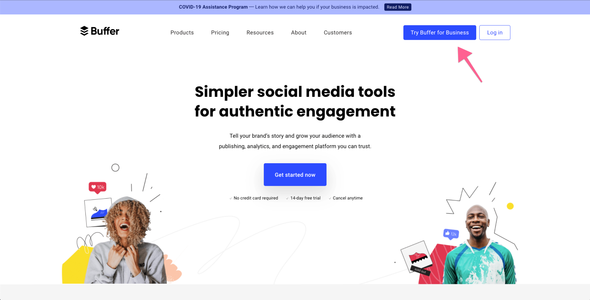 This "Try Buffer for Business" button is prominently displayed on our homepage and several other marketing pages. When we removed that button last year, the number of trials started fell by half. So we know many visitors are clicking that button with the intention to try Buffer.
The button led to a page that featured only a Publish plan. Strategically, it no longer makes sense because we want people to know Buffer is more than social media scheduling. We have great analytics, too!
We also heard confusion about that button. The copy is "Try Buffer for Business" because the page behind it features the Business plan for our Publish product. That plan was formerly known as the Buffer for Business plan. But Buffer now represents two products and not just Publish. People who started a trial on that page wanted to try all Buffer products and not just Publish.
High traffic, check. Strategic alignment, check.
Creating the right packages
The next thing to consider was what to offer.
We have two products, each with a different number of plans.
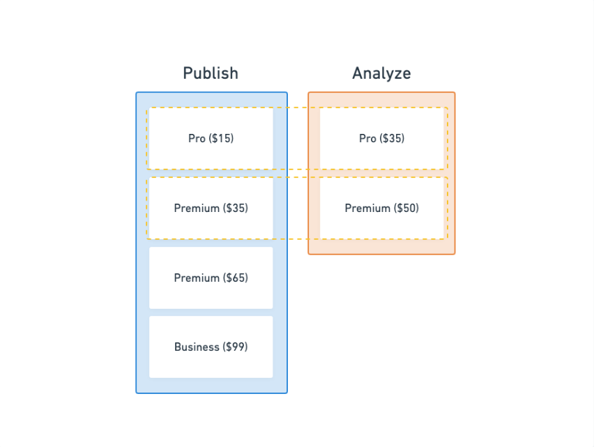
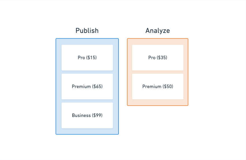 It feels quite natural to offer Publish Premium with Analyze Premium, and Publish Pro with Analyze Pro. The problem was Publish Premium allows up to six users while Analyze Premium only allows one user.
We created a cheaper Publish Premium plan ($35) that has all the same features but for only one user. This was a much better combination with Analyze Premium.
So we had our new packages:
- At $85/month, Publish and Analyze (Premium)
- At $50/month, Publish and Analyze (Pro)
Improving the message
I followed Copyhackers' copywriting principles while writing the previous landing page copy.
Start with a messaging hierarchy.
Be specific.
Use calls to value, not just calls to action.
I stuck to the same principles for this experiment because it worked for the previous experiment. The previous landing page had a signup rate of about five percent, which is above the average for SaaS websites (two percent).
I, however, changed the hero message. "Buffer for Brand Building" doesn't really tell visitors any useful. So I wrote something more targeted at their needs.
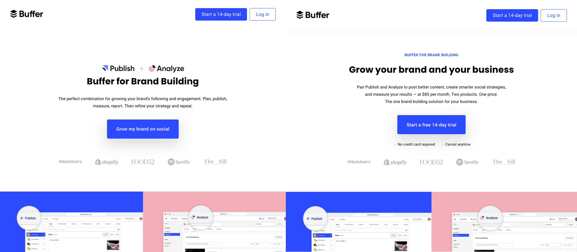 I also featured only the Publish and Analyze (Premium) package. I wanted the decision-making process to be as simple as possible. Remember, we have two products and five different plans in total. If you include the monthly or annual billing option, visitors have ten plans to choose from.
No monthly or annual billing. Just a single option.
 They could find the Publish and Analyze (pro) package in the FAQs.
I would have loved to make more changes to the landing page so that we could test more ideas but we didn't have the design and engineering capacity at that time.
As per all our A/B tests, we ran the experiment for two weeks and waited 28 days before analyzing the results [2].
Success!
The group that saw the package offering...
- started more Analyze trials
- started more Analyze subscriptions
- started fewer Publish trials but a similar number of Publish subscriptions
- started more multi-product subscriptions, which is a leading indicator for higher LTV
- generated 49 percent more MRR
Since rolling out the new landing page fully, we saw the number of Analyze trials started almost doubling from ~1,000 to ~2,000 per week. I'm also monitoring our weekly active users and subscriptions to assess the improvements as results could deviate from the experiment.
This experiment opened my eyes to the power of packaging. As a marketer, I had always focused on marketing channels and promotions but not packaging (or pricing).
In the future, if I'm brainstorming ideas for growth, I'll be sure to consider packaging as something to explore.
[1]: I personally dislike the idea of describing our offerings as bundles because bundles are usually cheaper than the individual products combined and we were not planning to offer discounts.
[2]: This is because our data team found that the majority of Buffer customers subscribed within 28 days of starting a trial. If they didn't convert by then, it's unlikely they would afterward.